Stats
Look, I'm not a statistician. I didn't even take any stats classes until my master's program. Everything I've learned has been as needed, and generally, I've always had a data team to work with to bounce ideas off of. So, I'm not going to teach you stats. However, I am going to tell you that you should learn some basic stats as a PM. It will help you understand what is happening and be able to storytell with numbers better.
My master's program borrowed heavily from this book, OpenStats, which is free. Choose the OpenIntro Stats books if you don't want to write code, and choose Intro to Modern Stats if you do want to write code.
I'll leave here a few key things to think about when working with stats as a PM.
Sampling
If you take a truly random sample of a large group and the sample is large enough, it will be representative of the whole. A key here is that it has to be truly random. If you start biasing this sample at all by selecting all men or selecting only people who will respond to emails, etc., then the sample is no longer representative of the whole as you've biased the sample.
Why do we talk about this? A big part of being a good PM is talking to your users. Part of that will be running studies on your users. If you can get a random sampling of your users and run some experiments, you can get information about what helps your product and what doesn't.
The p-value
This isn't the most advanced stats concept we will chat about, but it is important. A p-value can be thought of: "How confident are we in this statement." A more accurate way to state what the p-value is is, "How likely is there that these results would happen if the things we are measuring are totally uncorrelated to each other." But you can think, "lower p-values mean these two things are more closely correlated."
I'm not going to get too much more into it other than when you are presented with findings from a study either from your data team or from an outside researcher; it's good to ask what the p-values were. A lot of people arbitrarily have chosen a p-value of .05 (or 5%) as the threshold to call something statistically significant. That would mean there's a 5% chance that the study you just conducted was total happenstance and the two things are actually uncorrelated and a 95% that the two things indeed are correlated.
An example of that is if we did a study changing the button of our checkout process from black to red, and we saw an uptick in revenue of 15%. Then, we did a study on that to see if that was a causative relationship. If we found a p-value of .04 in the resulting study, we would say yes, the red did change the revenue. If it was .12, we would say it was inconclusive.
A little bit of graphing
Okay, so we have some stats in us now. Let's talk about graphs and showing metrics.
⛔️ First rule is never use pie charts. ⛔️
Now we have that out of the way, let's talk about why you want to use graphs. When we use metrics in papers and meetings, we need to have a reason to look at them. Numbers by themselves are not useful to show off; we use them to tell stories, describe changes, and identify needs.
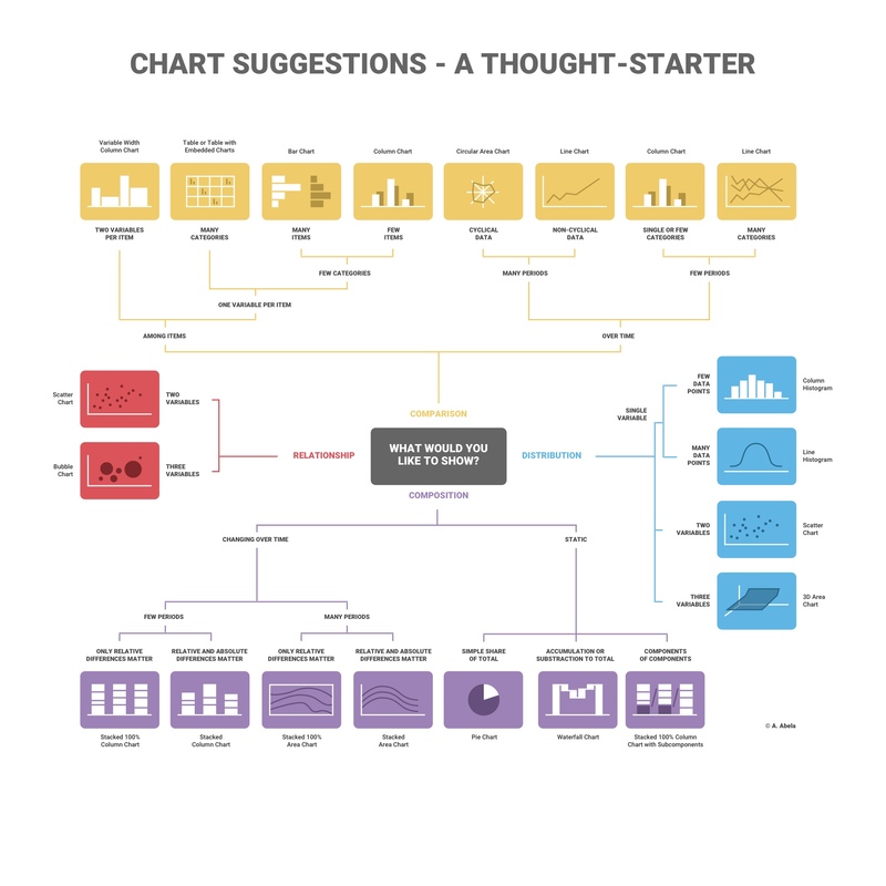 Via The Extreme Presentation™ Method
The above helper (or any other on the Internet) can help you choose an appropriate chart for the story you're trying to tell. Sometimes, you're trying to emphasize climbing costs in which a line graph could help, or one segment of all costs is growing faster than other segments in which a stacked bar chart could tell that story really well.
My point here is that point some thought into "what is a person glancing at this chart going to pick up on first." Use color, labels, and appropriate graph types to drive home points. A well-made graph can make a whole presentation.
Also, never use pie charts. Humans are not good at judging areas at a glance or working with changes in angles. They don't tell stories well at all, and there is always a better graph to choose.
