A well-made diagram can help a lot with understanding. It allows you to visually organize and tell a story that can be really, really hard to tell with words.
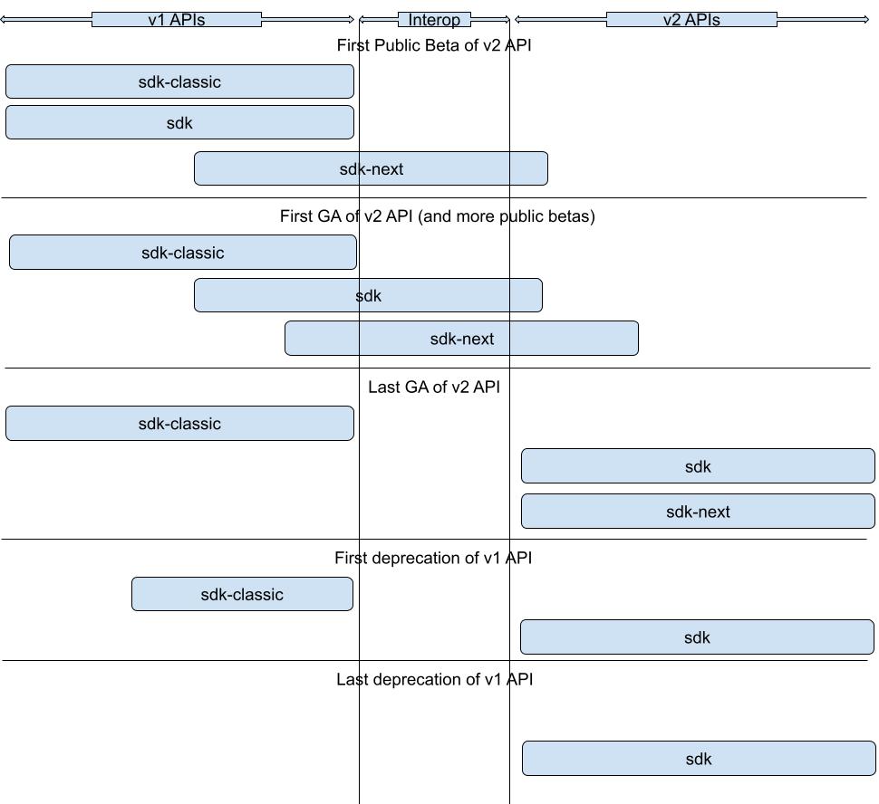
Here's a real-life diagram I made to explain how we were going to migrate a project to a new SDK architecture by maintaining three packages: sdk-classic for all of the old APIs, sdk with all the APIs in v1 and v2, and sdk-next with just v2 APIs. The interop is code to make v1 and v2 APIs work together. Once I showed people this diagram, it instantly clicked for all of them. (GA means "generally available" or that an API is deemed stable for public use.)
There are several tools you can use to make these sorts of diagrams.
- Google Drawings: The one I end up using the most because my company uses Google tools. Just type "drawing.new" into your URL bar you'll be dropped into a new drawing space. Very simple and great for diagrams.
- Excalidraw: The tool of preference for many of my coworkers. Also free for personal use as well as open source. Definitely more powerful than Google Drawing.
- Figma, Balsamiq, Canva, Sketch, Photoshop, etc.: Any design tool can work here, and if you're already comfortable with one, then go for it. You're just putting boxes on a page with lines typically. Heck, even macOS Preview or Microsoft Paint could work!
- I see people use Google Slides and Microsoft PowerPoint to do this as well.
- Flow chart software like Microsoft Visio or LucidChart can work well too.
If you have a preference for one of these, then use that. Otherwise, I'll recommend you start with Google Drawings, as it's pretty easy compared to the other tools.
It does not have to be pretty. It just needs to communicate a message.
